Data Reporting 101: Best Practices and Key Steps

Data Reporting 101

Understanding Data Reporting

Simply put, data reporting is the collecting and presenting of data. By standardising this process, organisations can track business performance over time. Data reporting is also a vital part of meeting regulatory requirements. Governmental bodies like Companies House in the UK and the SEC in the US require companies to submit annual and/or quarterly financial information.

Standardised data reporting is fundamental to the operation of all businesses. Where people use physical stimuli such as touch and sight to interpret their actions in the world, businesses use data. Data is how companies perceive and navigate their market, analyse their operations and make decisions. That means the quality, accuracy and comparability of data is paramount. Clear data reporting guidelines are required for data-driven decision-making.

In the US, more than three-quarters of companies report making data-driven decisions. In the past, companies would make decisions based on limited data and guesswork, or “intuition”. Modern business practices replace intuition with data and data analytics. Data can help businesses gain insights into market dynamics, consumer behaviour and internal performance that even experienced executives can overlook.

A lack of data literacy in an organisation can inhibit data reporting. In a business with low data literacy, data is de-prioritised, resulting in data that is patchy and old. Weaknesses in data gathering are compounded by ineffective data analysis and communication.

Let’s look at how to put high quality data reporting into practice.


Best Practices for Data Reporting

The data reporting process starts with data gathering and ends with the distribution or presentation of data and related insights. But getting from A to B requires a few more steps. 

Let’s run through the data reporting process.

Key steps in data reporting

1. Systems set-up

Before the data reporting process can begin, foundations need to be put in place. That could mean customer relationship management (CRM) systems, point of sale (POS) systems, website analytics, accounting software, email marketing software, and more.

You also need a way to create visualisations. Some software can do this natively or it can be achieved through specific data visualisation software like PowerBI or Tableau. 

For this part to work successfully, a strong collaborative culture between data and business teams goes a long way.

2. Data collection

The first step in the data reporting process is gathering raw data. The collection itself will be automated for the most part, but exporting data might be done manually. This step may include an accuracy and completeness check.

3. Data processing

Data processing involves cleaning and transforming raw data into a usable format. This can include removing duplicates, handling missing values and normalising or aggregating data for consistency. Trust in data only can come when the quality of data is prioritised throughout its lifecycle.

4. Data analysis

Data analysis involves crunching numbers to derive insights from the processed data. Data analysis can help spot trends, make forecasts or identify otherwise overlooked patterns. This is often handled by data specialists. But as we move towards a much stronger self-service future, it’s imperative that business users become comfortable navigating this landscape too.

 5. Data Visualisation

Data visualisation is the transformation of statistical data into an easily interpreted visual. BI tools make it easy to create graphs, charts and other types of visualisations that allow for easy comparison and understanding.

 6. Reporting

Reporting is the compilation of the data analysis and visualisations into reports or presentations. These reports can be in various formats, including PDFs, spreadsheets, PowerPoint presentations or interactive online dashboards.

7. Distribution

The final step is to distribute the data reports via documents or presentations to relevant stakeholders, such as management, employees, investors, clients or the general public. When analysing the data, you should always keep in mind who your audience will be. This will help filter out irrelevant data, and support a strong basis for whatever decision you’re advocating for.

 Example PowerBI report for Procurement and Vendors 
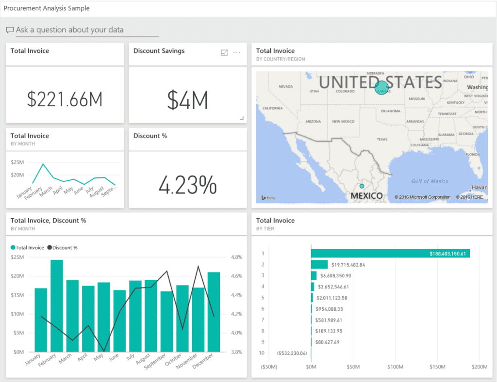
Example PowerBI report supporting insights of Procurement Teams

Data reporting quality standards

Now, let’s look at the standards that a high-quality data report must meet.

Accuracy and integrity

Hopefully it’s obvious that the accuracy and integrity of any data report are the top concern. Inaccurate data invalidates the whole report, whether or not the following standards are met. 

Integrity is slightly more subtle: it’s about whether the data and report are telling something truthfully, or whether there is data manipulation/sleight of hand creating a false narrative. In critical cases, such as company filings, the outcomes of inaccurate data and low integrity can be disastrous, such as large fines or even jail time. This is not a step to take lightly!

Clarity and Accessibility

A good report will meet high standards of clarity and accessibility. It will be consistent with other reports in terms of layout and tone and have a clear logical structure. It will lay out its key points and use concise language to avoid jargon. Accessibility-wise, a report should meet colour and contrast standards, use alternative text when required and be in a format that supports screen readers and similar tools.

Relevance and Context

A good data report considers audience needs, above and beyond accessibility and clarity, which are more universal. This includes practices such as locating the key points within broader business objectives, delivery that meets an audience’s preferred learning style and available technology compatibility. And if the audience is highly technical, then jargon, technical language and acronyms can be appropriate.

Use of Visuals

Presenting data in a way that can be understood easily is vital to data reporting. Visualisations enhance data comprehension by turning even the most complex numbers into basic concepts like “line goes up = good” and “bigger = more”. They also allow for easy comparison between data sets.

Storytelling with Data

Data storytelling wraps data in a narrative structure that engages and informs. Narratives are easier to remember and connect with. A good report told through data will start with a problem statement and progress through the method towards a conclusion. It will wrap up with a call to action or key recommendation(s).

Actionable Insights

Lastly, good data reports provide actionable insights. Actionable insights lead to better data-driven decision-making and the ultimate purpose of a data report. So whether it’s to change a strategy, tweak marketing copy or focus resources, a report should be a driver for change.

Implementing Best Practices

Let’s dig into how to implement these best practices we’ve described.

Tools and Technologies

The data reporting ecosystem is expansive. Business intelligence platforms like Power BI, Tableau, Qlik and Looker can create advanced data visualisations and interactive dashboards. Each has their own strengths, weaknesses and use cases. Courses, like Data Literacy Academy’s ‘PowerBI Creator’ or ‘Self-Serve Analytics’, provide staff with the key knowledge to leverage data analytics and create data visualisations.

Analytics platforms allow for tracking of digital customer behaviour and business performance. Software like Google Analytics allows users to analyse e.g. web traffic, user behaviour and conversions, while something like IBM Cognos Analytics provides reporting, analytics, score carding and event and metric monitoring. There are loads of options out there. If the marketplace seems overwhelming, we can help you understand your needs and support picking the right tech stack.

Developing a Reporting Strategy

Data analytics needs to work in service of overarching business goals. Here’s how to structure the data reporting process to ensure alignment with corporate strategy and standardisation across company reporting:

1. Business goals, objectives and KPIs

A data report needs to relate to business goals and objectives. Senior staff should communicate these regularly to keep them top-of-mind. Ideally, any recommendations the report produces will advance these business goals or move the needle on a KPI or two. Staff need to understand the difference between goals, objectives and KPIs and how they can be influenced.

2. Choose Appropriate Tools and Technologies

Business goals and objectives and user needs will inform technology procurement. Your business goals might require printed reports to send out, you might need user-friendly data visualisation tools or you might need a way of bridging various data lakes to attain broad operational reporting.

3. Establish data management and access rules

Establish rules around how data is accessed. A company might prefer to use a data gatekeeper who is responsible for overseeing analytics projects. Or it might use a self-service model that empowers staff to use data without technical skills. Whatever a company’s approach to data access and management, the rules should be clearly laid out.

4. Upskill on BI tools and data literacy

To reach a high standard of data reporting across the board, training in the relevant tools is needed. Staff should be able to produce data visualisations and present reports to a high standard. This includes polished PowerPoints and clear and confident spoken delivery. Data literacy training helps staff become confident with data tools and act in a data-led way in all aspects of their job.

5. Design a reporting framework

To ensure standardisation of report layout and appearance, create some report templates. There needs to be enough to cover a range of report types without providing overwhelming choice. Employees should have ready (read-only) access to design assets and slide masters to accelerate the report creation process. Terminology needs to be established, e.g. revenue vs turnover, to ensure cohesion.

For regular reporting, frequency or cadence needs to be established. Regular reporting allows for easy comparison, cements good data habits and helps maintain focus on key business objectives.

6. Implement and Monitor

Make sure employees and executives all understand what is required of them to meet internal data reporting standards. It can be a good idea to appoint a champion to monitor the reporting process and identify – ideally with data! – points of optimisation.


Benefits of Effective Data Reporting

There are three main benefits of effective data reporting.

Clear, accurate and actionable data reporting allows businesses to maximise their potential. Data reporting is how companies know what’s going on. It’s how they know how well their products are performing, how smoothly their supply chain is operating, how sound their financial position is and so on. And this knowledge facilitates well-informed and objective decision-making, which in turn drives business performance.

Data reporting is an effective way of communicating. There is much less scope for miscommunication when information is conveyed via charts and graphs in a clear and logical structure. Data can also be disseminated and shared easily via reports, increasing collaboration and a common understanding.

Data reports also help solidify certain productivity-boosting behaviours. They are fundamental to a strong data culture, where a company thinks, communicates and acts through data. Putting numbers against performance makes it accountable. An actual target is motivating to reach and allows for more accurate assessment of performance and progress.

Taken as a whole, effective data reporting drives both broad and targeted business outcomes. It can help maximise ROI, improve customer satisfaction and optimise risk management.


Next steps

In this blog, we’ve touched on what data reporting is, how to set up a data reporting system and how to achieve high standards in data reporting. We’ve also discussed how to implement best practices such as tools and technology and how to build a supporting structure around data reporting.

If you want to learn more about how to implement high data reporting standards in your business, talk to our team. We help enterprises implement data literacy programmes. We offer courses and workshops suited to enterprises at all stages of data literacy readiness.


FAQ

What are the different types of data reports?

Because data can be used to explain many things, there are many types of data reports. Common ones include expense reports, financial reports, sales and marketing performance reports and growth reports.

What tools can be used to create data reports?

Various software types are used in the six data report creation steps. These include business intelligence software like Power BI and Tableau (there are many more, though), web analytics tools like Google Analytics and presentation software like PowerPoint.

How can I improve my data reporting skills?

You could self-educate using instructional material offered by the software providers your company uses. Or, a third-party company like Data Literacy Academy can provide targeted upskilling as well as a greater understanding of data and how to use and communicate it.

Is data reporting essential for all types of businesses?

Companies that don’t embed good data practices into their operations risk being left behind. This is particularly true of enterprise organisations, which are complex with many moving parts, extensive product lines and large numbers of employees. Without data reporting, the company will have an inaccurate understanding of its operations, leading to mistakes in decision-making and strategy.

What are the key components of an effective data report?

An effective data report will contain high-quality data, a clear and logical structure, ties to overarching business objectives, appropriate language, strong visual language and key recommendations.